The beginning of a new experiment.
Recently, we put out an open call for participants in an experiment: fill out a form, and we’ll write up a blog post reviewing and giving you concrete recommendations for how to improve your pricing, from packaging to presentation. If you like the post, give us permission to publish it, and we’ll get on a **free 45-minute video chat **to discuss your pricing and strategy. If this sounds like something you’d like to do, fill out the form here!
This is the first entry in our new series, with the brave folks at Groups.io. Thanks to Mark Fletcher for working with us! Let’s get started!
Groups.io is “a modern email groups service.” According to their marketing material:
Groups are easy to join and manage, and are packed with powerful features. And it’s free, for any size group.
All of our posts in this series will look at the same elements of a pricing page: The Heading, Self-Service Plans, Enterprise Plans, and Messaging & Audience. We’ll then end each post with a section outlining our recommendations.
The Heading
The heading reads “Plans And Pricing” — a very common (some would say “tried and true”) way of starting a pricing page. While safe, I think it’s nice to differentiate a bit here — most people who are here clicked on a link that said “pricing,” so they know where they are.
The subheading and button CTA do a nice job of getting people on board immediately, creating a little mini-funnel above the actual plan listings below.

The heading and subheading, with bonus CTA.
This is heavily optimized for just getting people started, which seems to be Groups.io’s modus operandi for this marketing site. Not a bad approach. It’s possible that they might want to point out that a “Basic group” is free up front, but you’d have to experiment properly to figure out which performs better here.
Self-Service Plans
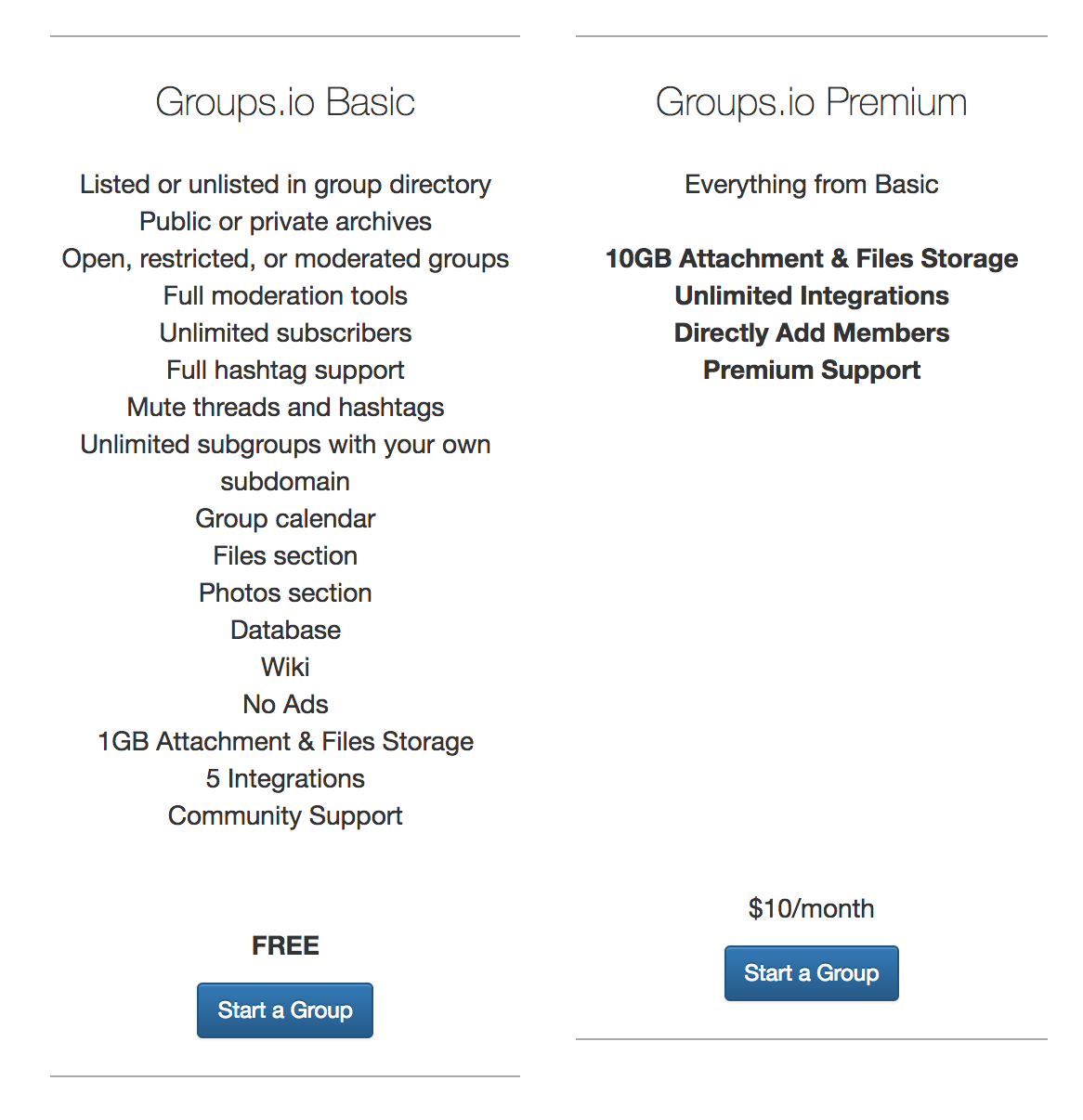
There are two self-service plans offered — Basic and *Premium. *Basic is free, and premium costs $10/month, ostensibly per group.


Self-service and Enteprrise options
There are a whopping eighteen features listed below “Basic” — this is what you get for free when you sign up for a free group. Premium is differentiated by offering more of what you get in Basic:
-
Larger attachments and more storage
-
Unlimited integrations
-
The ability to directly add members (it’s not very clear what this means)
-
Premium support (with no specific definition of premium)
The visual presentation and quantity of features below basic makes it hard to digest everything that I get when I buy a plan. I’m a big believer in paring feature lists way, way down to those things that are selling points. Things people who buy the product actually care about. Think about it like this: you should be selling customers on what they’ll be able to do once they buy your product, not what your product can do.
The names “Basic” and “Premium” also leave a bit to be desired here. It might be interesting to find better domain terms to describe the types of groups which might need the higher-tier, paid service. Is it a “Serious Organization” vs. a “Hobby Group?” Naming plans in a way that aligns their communicated value with the desired value of the customer is crucial to well packaged pricing plans.
Enterprise Plans
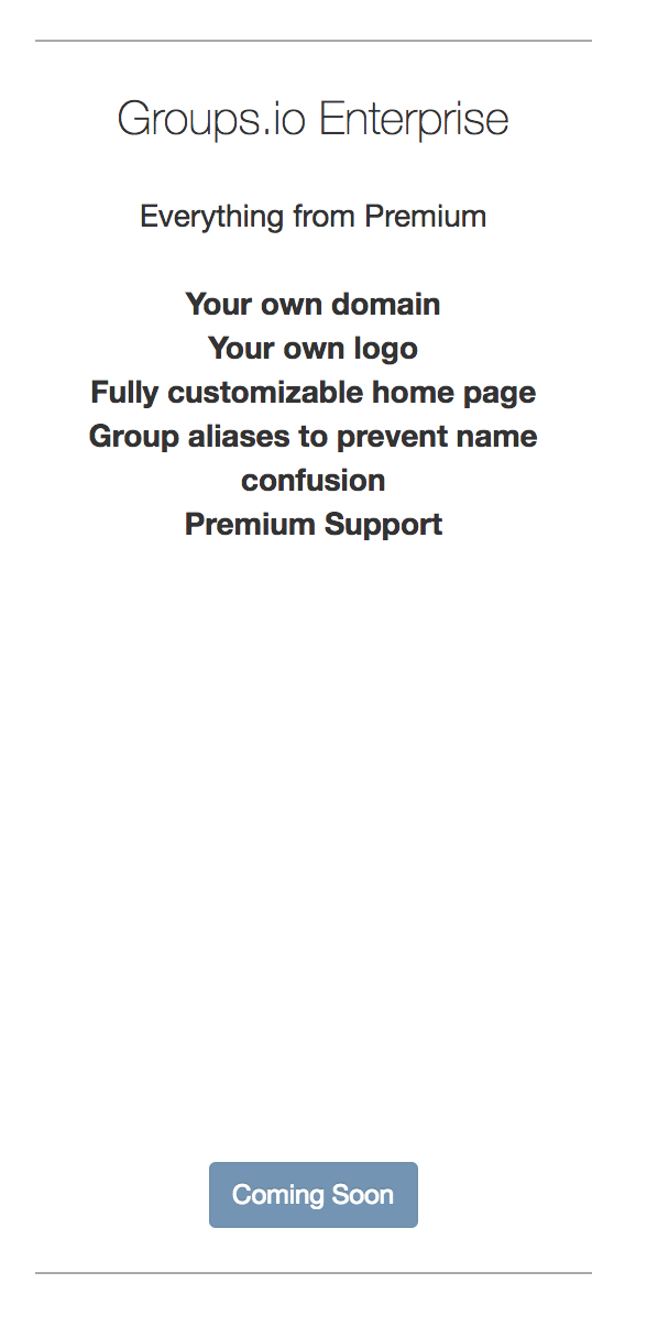
Enterprise plans are also feature differentiated and seem to revolve around a white label version of Groups.io. This plan isn’t offered yet, but instead of a button that says “I’m interested,” which would let people register interest, there is a grayed out button which doesn’t do anything. A missed opportunity!
Messaging & Audience
There isn’t a ton of personality in this page, which is probably a reaction to the fact that their service ostensibly serves a large number of markets and types of people. This is a pretty safe way to play it, but on the other hand, it comes off a bit bland.
It would be nice to have some unifying theme throughout the text of this page that connected potential customers to the brand promise that Groups.io offers.
Recommendations
Overall, Groups.io’s pricing seems on the cheap side for what they’re offering. They’ll have to sell a tremendous volume of these groups to make the product really work. It would be interesting to see what the results of a willingness to pay conversation with existing Basic and Pro users would look like.
The headings, along with the messaging, could use some more flavor — get potential users excited and sell them on the value of using Groups.io before they’ve even seen how great it is.
For self-service plans, consider new names which are aligned with the value that each segment should derive from using the product. Clean up and pare down the feature list. Implement a grid format that easily distinguishes Basic from Pro.
Make the fact “Enterprise” is is coming soon a feature, not a detraction. Let people register interest by filling out a form and emailing when they have something to say about the kinds of features they’d like in this product.
Overall, Groups.io has a straightforward value proposition built for a use case that a lot of people have — organizing over email. Hopefully these recommendations can help them take it to the next level.
What do you think of Groups.io’s pricing page? If you would like to share your opinion or would like us to review your page next, fill out this form, let us know via email or in a response!
